

Following https://tarte.nuage-libre.fr/c/fediverse/p/194717/we-need-more-users I decided to explore data a little bit more. I’m not the biggest fan of growth-as-as-target so I wanted to see how much the people were participating in the discussion.
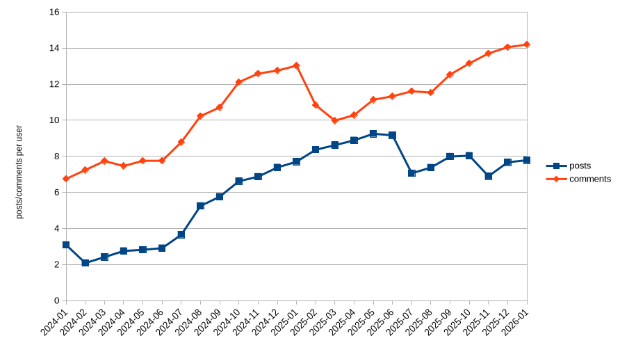
The data
I took the data from the API explorer in https://api.fediverse.observer/ with this query:
query {
  monthlystats {
    date_checked
    softwarename
    total_posts
    total_users
    total_comments
  }
}
Then parsed the json with this https://jqlang.org/ filter:
jq '.data.monthlystats | map(select(.total_users > 0 and (.softwarename == "lemmy" or .softwarename == "mbin" or .softwarename == "kbin" or .softwarename == "piefed"))) | group_by(.date_checked) | map( {date_checked: .[0].date_checked, total_users: ([.[] | .total_users] | add), total_posts: ([.[] | .total_posts] | add), total_comments: ([.[] | .total_comments] | add)}) | map({date_checked, posts: .total_posts/.total_users, comments: .total_comments/.total_users}) | sort_by(.date_checked) | map([.date_checked, (.posts | tostring), (.comments | tostring)]) | .[] | @csv'
(As you see I filtered for the threadiverse. I also did the same with all software, I’ll put the graph for that in comments)
Then did a good old’ chart
What to think of it
I don’t know. Users’ activity is on the rise and I find it nice
A “per user” graph is not indiciative of the number of users, or any change in that metric. You cannot use this graph to determine any effect of the total user count.